Republished from a multipage article at http://worldbeyondwar.org/mapwar
When it comes to understanding wars, for some people, a picture of the dead or of the injured or of the traumatized or of those made refugees can be worth ten million words. And, for at least some of us, a picture of where war is in the world can be worth at least a thousand.
What follows are two dozen pictures mapping war and militarism and the struggle for peace overlaid on a global image of nations. These are drawn from — and you can create your own with — an online tool for mapping militarism published by World Beyond War at bit.ly/mappingmilitarism. This tool has just been updated with new data. On many of the maps at that link, unlike with the static images that follow, you can scroll back in time to see changes over recent years.
By laying some important facts about war on the map, we’re able to recognize some ideas that rarely make it into prose. Here are a few examples:
- The war in Afghanistan and the foreign occupation of Afghanistan have officially ended, but a map of the nations with troops still occupying Afghanistan still looks like NATO colonialism.
- The list of locations of severe wars changes from year to year but sticks to a certain region of the world — a region in which none of the major producers of the weapons of war and few of the big spenders on war can be found — but from which the bulk of refugees flee and in which the biggest concentration of that violence labeled “terrorism” germinates, these being two of war’s many tragic consequences.
- The United States dominates the war business, the sale of weapons to other nations, the sale of weapons to poor nations, the sale of weapons to the Middle East, the deployment of troops abroad, spending on its own military, and the number of wars engaged in.
- Only Russia is anywhere close to the U.S. in weapons dealing, and this pair of countries nearly splits the vast majority of the nuclear weapons possessed on earth.
- Efforts toward peace and disarmament are widespread and coming largely from the less-armed, less bellicose parts of the world, but not entirely.
- And those governments that are otherwise doing well by the world tend to be those not engaged in warfare (“humanitarian” warfare or otherwise).
The presentation that follows can also be found as a “prezi” (a variation on what’s more commonly called a powerpoint and used to be called a slide show). You can grab the prezi for your own use at the World Beyond War events resources page.
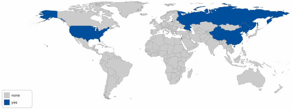
WHICH NATIONS HAVE TROOPS IN AFGHANISTAN?
As noted in a petition to end the war in Afghanistan, which you are welcome to sign, the U.S. military now has approximately 8,000 U.S. troops in Afghanistan, plus 6,000 other NATO troops, 1,000 mercenaries, and another 26,000 contractors (of whom about 8,000 are from the United States). That’s 41,000 people engaged in a foreign occupation of a country, 15 years after the accomplishment of their stated mission to overthrow the Taliban government.
The sources for all the data in all the maps are noted on the map tool at bit.ly/mappingmilitarism. In this case, the source in NATO, which claims 6,941 U.S. troops in Afghanistan. The slightly higher 8,000 figure comes from the U.S. commander in December expressing a hope to reduce the troop number to 8,400 by January 20.
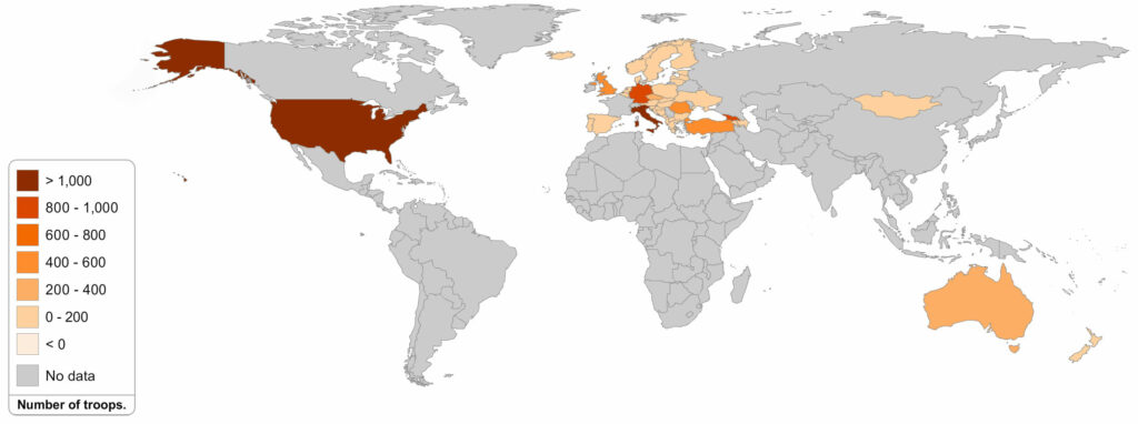
Take a look at where the troops occupying Afghanistan all come from. It’s NATO plus the U.S.’s kangaroo sidekick down under plus 120 Mongolians. It’s the world’s self-appointed but generally resented policemen and a few hired security guards. Here’s an argument that they are doing more harm than good.
WHERE ARE THE WARS?
The three maps immediately below indicate where wars resulting in 1,000 deaths or more during the year have been located in 2016, 2015, and 2014.
2016:
2015:
2014:
There is in the maps above a major overlap with those nations possessing large quantities of oil, but virtually no overlap with those nations producing large quantities of weapons.
There is also a major overlap with those nations “liberated” or otherwise bombed by the United States during the past 16 years. Afghanistan, Iraq, Libya, Syria, Pakistan, Somalia, and Yemen — all bombed by the U.S. military in recent years — do not know peace. Nor do some of their neighbors into which weapons and violence have overflowed.
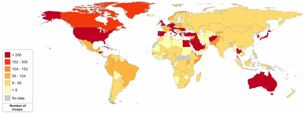
The map below, in red, orange, and yellow, shows countries that the U.S. military has been bombing during the past six years. The data displayed is the number of “weapons released” according to the U.S. Air Force. This far understates the complete reality. Not only does this data not include any count of U.S.-assisted Saudi strikes in Yemen, but — as recently reported — the United States has made compiling this type of data difficult and has misled U.S. media into dramatic understatements, by not reporting air strikes by various branches of the military other than the Air Force, and by using the term “air strike” to mean all sorts of different things, including the dropping of one bomb or the assault on a target by multiple planes dropping numerous bombs. Even statistics on “weapons released” by one branch of the U.S. military do not include small rockets or cannon fire. An A10 Warthog cannon fires up to 70 30mm depleted uranium shells per second. That’s not included here.

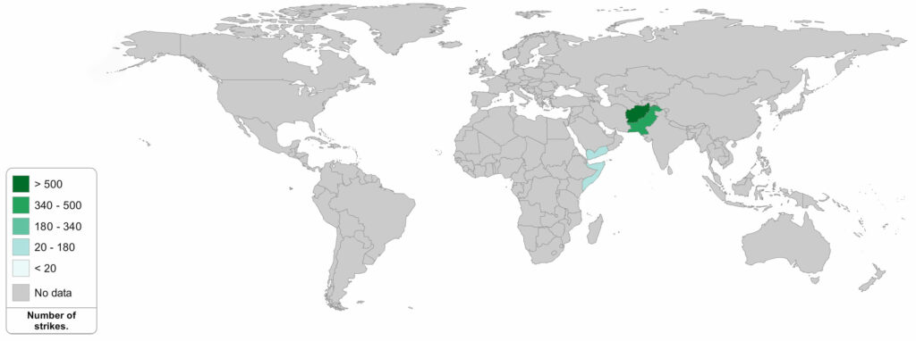
Here below is a similar map, using some of the same data, but displaying in particular missile strikes from U.S. drones. This relies on the reporting of the Bureau of Investigative Journalism.
WHO DEALS THE WEAPONS?
While it’s tempting to blame wars entirely on the culture of the people where they’re waged, as it must have been tempting to blame the Chinese on whom opium was pushed or the Native Americans to whom colonial settlers gave alcohol, the fact is that war’s tools are manufactured in wealthy nations that export war.
The maps below are based on U.S. data from a Congressional Research Service report published after World Beyond War and RootsAction.org lobbied for it.
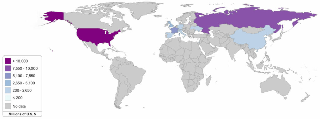
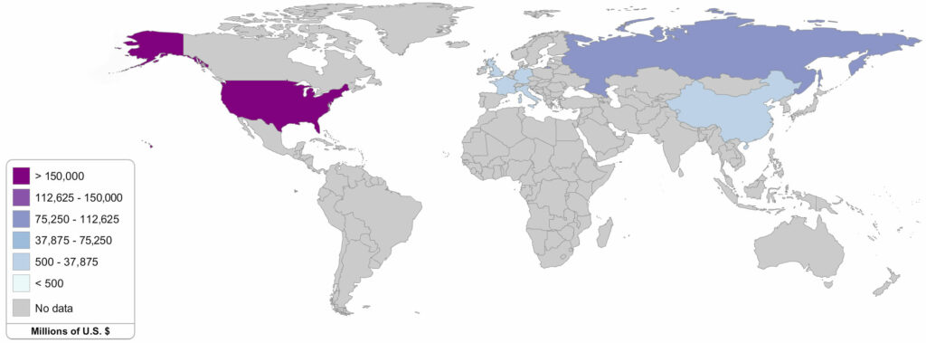
The first map below shows nations that export weapons to the rest of the world. A handful of nations dominate this racket, led by the United States, followed closely by Russia, with the other permanent UN Security Council members (China, France, UK) doing their part to end war by bringing up the rear together with Spain and Germany.
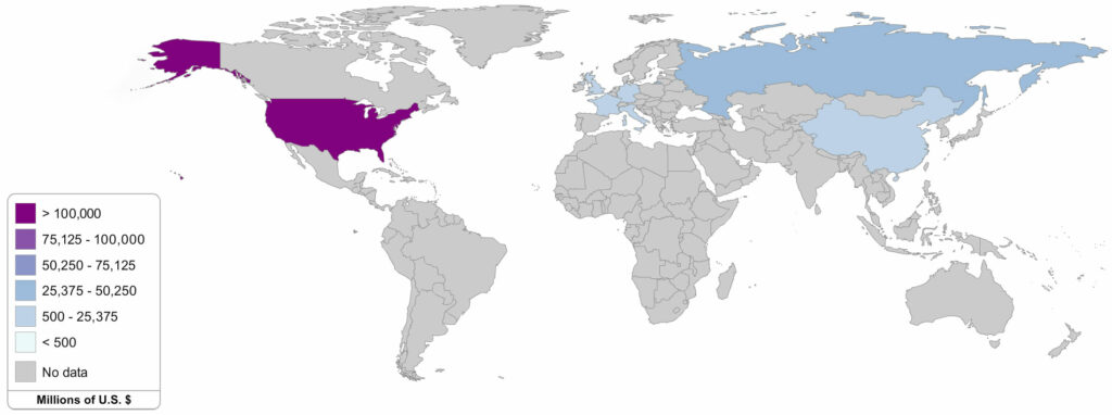
The next map illustrates the gentle humanitarian efforts of pushing war weapons on the poor nations of the world that are unable to manufacture such blessings on their own. In the measure of weapons actually delivered to poor countries in 2014, Russia edges into the top spot, with the United States just behind. As above, Ukraine begins to make a showing here.

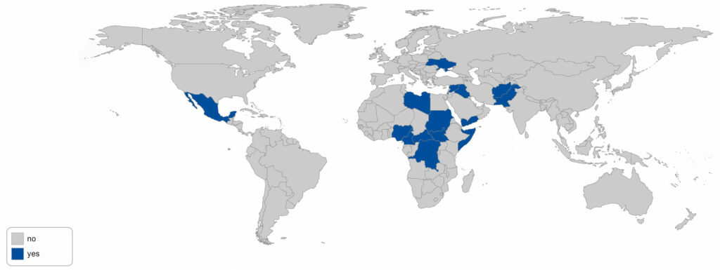
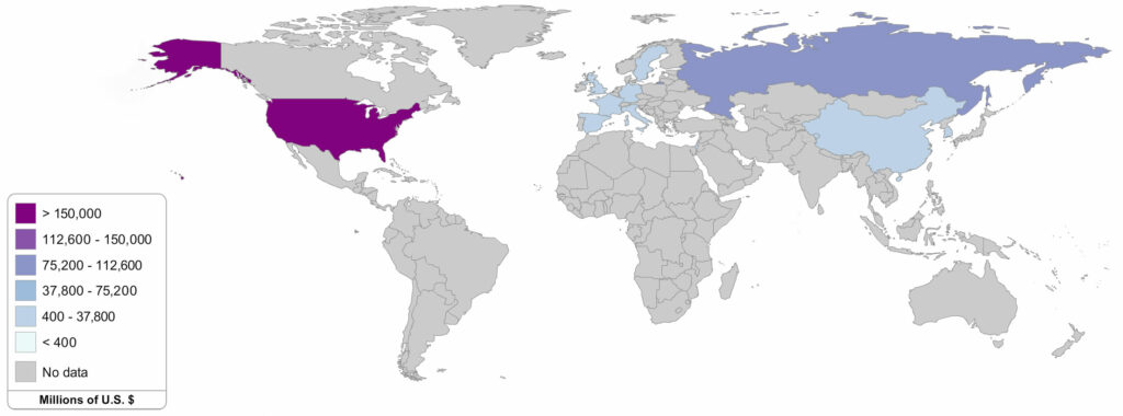
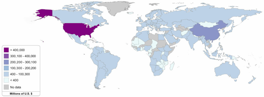
The map below is not good news, as it illustrates future weapons deal agreements reached by each nation in the 2007-2014 period, whether all of those weapons have yet been delivered or not. The United States is back on top here. In fact, nobody else is anywhere close. Sweden’s image as relatively peaceful suffers here.
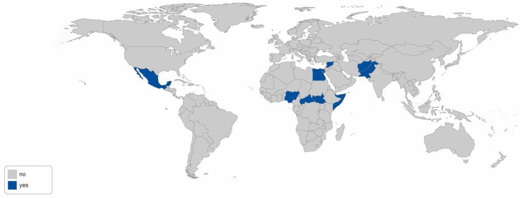
Below is a map showing agreements reached in 2014 to export weapons to poor countries. The U.S. has no real competition in this trade. Keep reading to find out which poor countries we’re talking about.
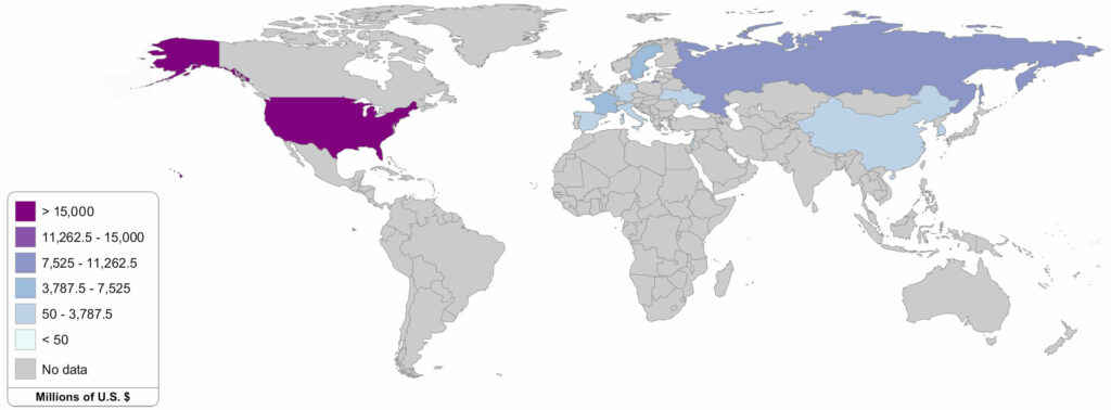
Here’s a map of agreements reached between 2007 and 2014 to sell weapons to poor countries:
And, finally, a map of agreements reached between 2007 and 2014 to sell weapons to the Middle East:
To advance the cause of divestment from weapons dealers, click here.
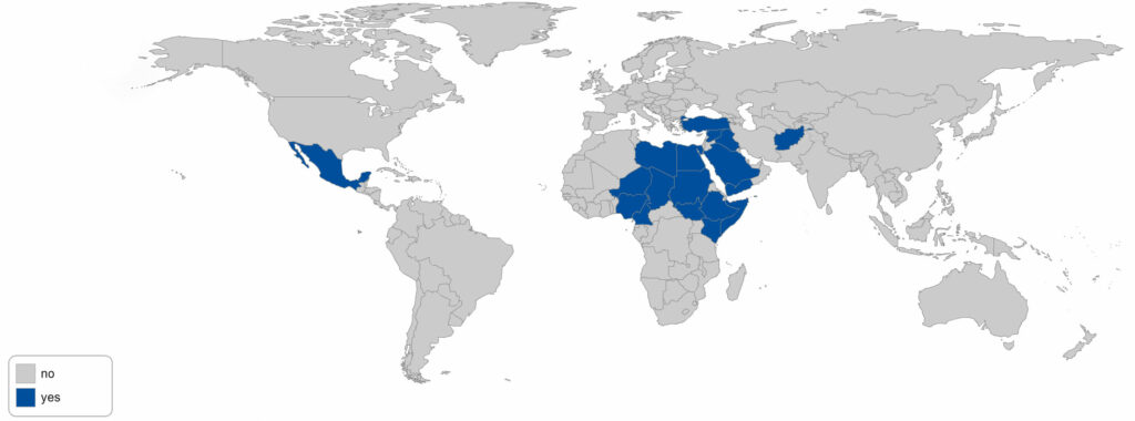
So, the United States sells the most weapons to other countries. Which countries does it sell them to?
WHO DOES THE UNITED STATES SELL TO?

The map above includes democratic governments, brutal monarchies, and everything in between. Some of the regular customers shown here can only be sold weapons in violation of U.S. and international laws. Part of what drives these sales in one country is these sales in neighboring countries. Part of what drives them is aggressive marketing by the U.S. State Department. And part of what pushes the arms race along is the incredible lead set by the United States’ own weapons purchases.
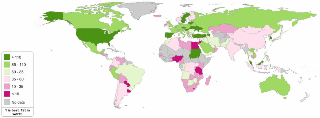
WHO FUNDS THE MILITARISM?
The above map almost certainly understates the U.S. role in funding militarism. The data is taken from SIPRI, the Stockholm International Peace Research Institute. While SIPRI cites the figure of $596 billion for U.S. military spending, a full tally of military spending across numerous departments reaches over $1 trillion per year. It is unlikely that SIPRI has under-reported or under-estimated other nations’ spending to the same extent. A rough total for the entire rest of the world is another $1 trillion per year. That $2 trillion is augmented each year by trillions of dollars in destruction by wars and trillions of dollars more in lost economic opportunities. World Beyond War argues that military spending impoverishes those nations engaged in it, rather than enriching them, and that — because a tiny fraction of military spending could end starvation, cure diseases, and otherwise transform the world for the better — we have a moral duty to make a transition.
This is not a moral duty to risk our lives, if World Beyond War is right that investing in war endangers us rather than protecting us.
WHO’S GOT THE NUKES?
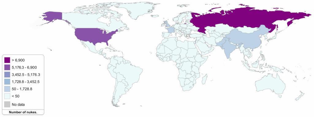
Above we see a map of where the nuclear weapons are. They are not in Ukraine, Belarus, Kazakhstan, or South Africa — nations deserving the highest praise for having given them up. They are not — contrary to widespread U.S. false belief — in Iran. They are in Russia, the United States, China, France, the UK, Israel, India, Pakistan, and possibly North Korea. According to the Federation of American Scientists,
“Despite five North Korean nuclear tests and an estimate inventory of fissile material to potentially produce 10-20 nuclear warheads, there is no publicly available evidence that North Korea has miniaturized and operationalized nuclear warheads for delivery on ballistic missiles. A 2013 world survey by the U.S. Air Force National Air and Space Intelligence Center (NASIC) did not credit any of North Korea’s ballistic missiles with any nuclear capability.”
In addition to the perilously large list of nations above, there are U.S.-owned nuclear weapons in the Netherlands, Belgium, Germany, Italy, and Turkey.
Contrary to common complacency producing myths, there is no such thing as a small nuclear war. A “limited” nuclear war by any of the countries listed here risks producing a nuclear winter and mass starvation, as well as other severe environmental damage, worldwide.
AND WHO’S GOT THE CHEMICAL AND BIOLOGICAL WEAPONS?
The above is far less certain than the rest of these maps and based on the most recent and credible data we can find. Nations known or credibly alleged to possibly possess chemical and/or biological weapons include the permanent members of the UN Security Council not in Europe (U.S., Russia, China) plus North Korea and Israel.
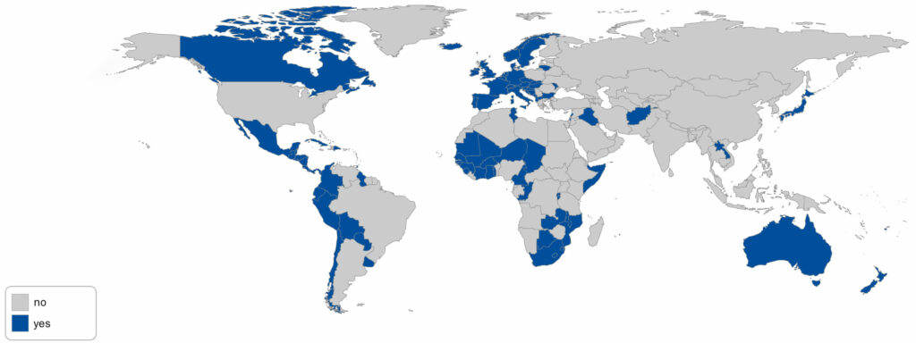
WHERE ARE U.S. TROOPS?
When the announcers thank U.S. troops for watching sporting events from 175 countries, do you ever wonder which 175 countries those are? Have a look:
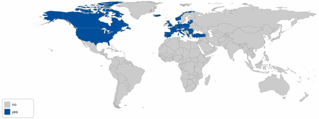
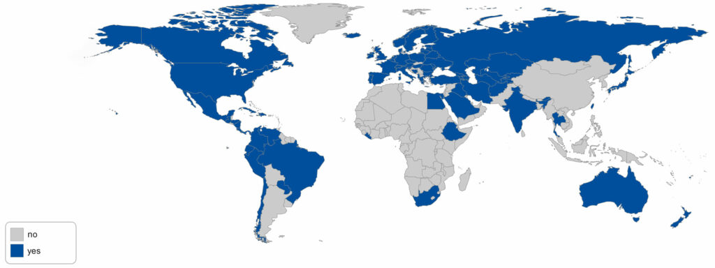
Here are NATO’s members:
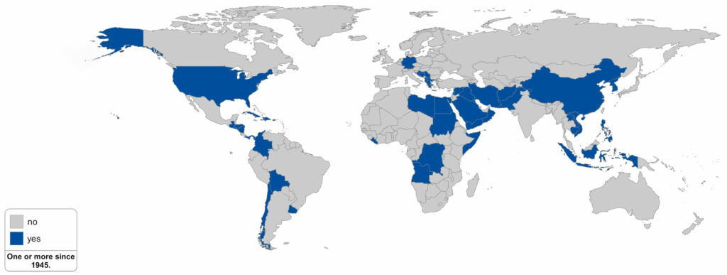
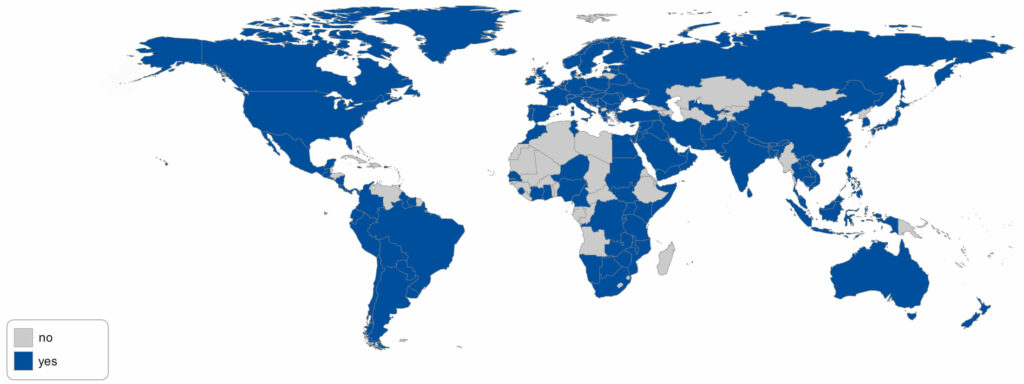
And here are nations where the United States has waged war or militarily “intervened” in a major way since World War II:
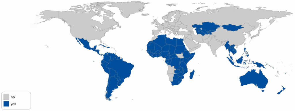
Below are countries that have joined the International Criminal Court. They include Afghanistan, where the ICC claims to be considering prosecuting the United States. In a recent poll 73% of people polled in the United States favored the U.S. joining the court. To urge the ICC to act fairly, click here. This effort is part of World Beyond War’s global justice campaign.

Below are countries that are party to a treaty banning all war, the Kellogg-Briand Pact:
The presentation above can also be found as a “prezi” (a variation on
what’s more commonly called a powerpoint and used to be called a slide
show) at the World Beyond War events resources page.
This report was produced by David Swanson who thanks Sandy Davies for information on air strikes.
David Swanson is an author, activist, journalist, and radio host. He is director of WorldBeyondWar.org and campaign coordinator for RootsAction.org. Swanson's books include War Is A Lie. He blogs at DavidSwanson.org and WarIsACrime.org. He hosts Talk Nation Radio. He is a 2015, 2016, 2017 Nobel Peace Prize Nominee.
Follow him on Twitter: @davidcnswanson and FaceBook.
Sign up for these emails at https://actionnetwork.org/forms/articles-from-david-swanson.
david swanson