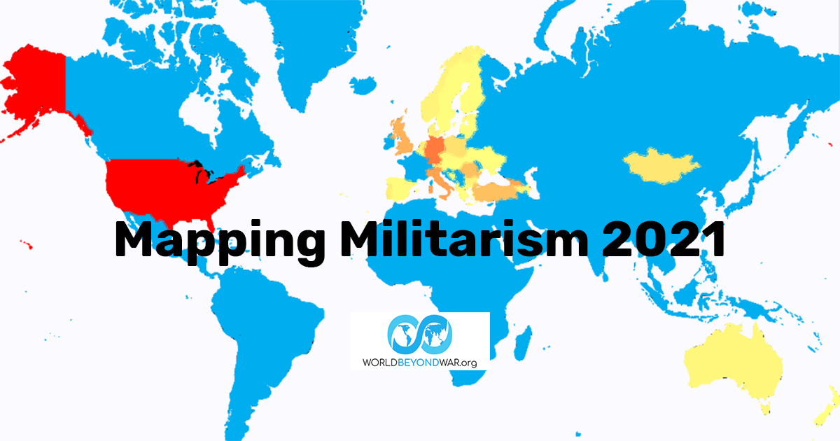
Mapping Militarism 2021
By David Swanson, World BEYOND War, May 3, 2021
https://worldbeyondwar.org/mapping-militarism-2021/
This year’s annual update to World BEYOND War’s Mapping Militarism project uses a completely new mapping system developed by our Technology Director Marc Eliot Stein. We think it does a better job than ever of displaying the data of warmaking and peacemaking on maps of the world. And it makes use of new data reporting on the latest trends.
When you visit the Mapping Militarism site, you will find seven sections linked across the top, most of which contain multiple maps listed down the lefthand side. Each map’s data can be seen in map view or list view, and the data in list view can be ordered by any column you click on. Most of the maps/lists have data for a number of years, and you can scroll back through the past to see what’s changed. Every map includes a link to the source of the data.
The maps included are as follows:
WAR
wars present
drone strikes
U.S. and allies air strikes
troops in Afghanistan
MONEY
spending
spending per capita
WEAPONS
weapons exported
U.S. weapons imported
U.S. military “aid” received
NUCLEAR
number of nuclear warheads
CHEMICAL AND BIOLOGICAL
chemical and/or biological weapons possessed
U.S. EMPIRE
U.S. bases
U.S. troops present
NATO members and partners
NATO members
U.S. wars and military interventions since 1945
PROMOTES PEACE AND SECURITY
member of international criminal court
party to Kellogg-Briand pact
party to convention on cluster munitions
party to treaty on prohibition of nuclear weapons
signed treaty on prohibition of nuclear weapons in 2020
member of nuclear-free zone
residents have signed World BEYOND War declaration
The map of where the wars are, disturbingly, shows more wars than ever, despite a global disease pandemic and demands for a ceasefire. As always, the map of places where the wars are has hardly any overlap with maps of where the weapons come from; and the list of places with wars by no means includes all the nations engaged in wars (often very far from home) — such as those nations highlighted on the map of places with troops in Afghanistan.
The maps of what we know about drone strikes add to the picture of wars, thanks to data from the Bureau of Investigative Journalism, as do the maps of what the U.S. government admits to on numbers of air strikes.
“China is now a true peer competitor in the military,” claimed Thomas Friedman on April 28, 2021, in the New York Times. This sort of claim is debunked by the maps on spending and spending per capita, which we’ve created using data from Stockholm International Peace Research Institute (SIPRI). SIPRI leaves out a great deal of U.S. military spending, but is the best set of data available to compare nations with each other. It turns out that China spends 32% what the United States does, and 19% of what U.S. and NATO members/partners do (not including Russia), and 14% of what the United States plus allies, weapons customers, and military “aid” recipients spend together on militarism. In per capita terms, the U.S. government spends $2,170 on war and war preparations for every U.S. man, woman, and child, while China spends $189 per capita.
When it comes to military spending in 2020 U.S. dollars, the biggest offenders are the United States, China, India, Russia, the UK, Saudi Arabia, Germany, France, Japan, and South Korea.
When it comes to military spending per capita, the leading spenders are the United States, Israel, Singapore, Saudi Arabia, Kuwait, Oman, Norway, Australia, Bahrain, and Brunei.
Another area dominated by the United States is weapons. Not only does the United States export the most weapons, but it exports them to much of the world, and bestows military “aid” on the vast majority of the world, including most of the world’s most brutal governments.
When it comes to the number of nuclear warheads possessed, these maps make clear that two nations dominate all others: the United States and Russia, while the nations about which we have the best knowledge of possessing chemical and/or biological weapons are the United States and China.
There are other areas so dominated by the United States that it makes no sense to include other nations on the map, except as impacted by the United States. So, the maps in the section on U.S. Empire include the number of U.S. bases and troops per country, each country’s membership or partnership with NATO, and a global picture of U.S. wars and military interventions since 1945. This is ever more a global operation.
The set of maps on the promotion of peace and security tell a different story. Here we see different patterns, with countries standing out as leaders on the rule of law and peacemaking that are not among the leaders in warmaking on the other maps. Of course, many countries are a mixed bag of steps away from and toward peace.
We hope these maps serve as guides to what’s needed and where, going forward!
##
--
David Swanson is an author, activist, journalist, and radio host. He is executive director of WorldBeyondWar.org and campaign coordinator for RootsAction.org. Swanson's books include War Is A Lie. He blogs at DavidSwanson.org and WarIsACrime.org. He hosts Talk Nation Radio. He is a 2015, 2016, 2017, 2018, 2019 Nobel Peace Prize Nominee.
Follow him on Twitter: @davidcnswanson and FaceBook.
Help support DavidSwanson.org, WarIsACrime.org, and TalkNationRadio.org by clicking here: http://davidswanson.org/donate.
Sign up for these emails at https://actionnetwork.org/forms/articles-from-david-swanson.
